
In short
- An IQ score is normed on humans and floats free of meaning when applied to AI.
- Contamination means high IQ scores may reflect memorization, not reasoning.
- Memorization-resistant benchmarks like ARC-AGI expose the gap between apparent and real ability.
- Honest rulers (GPQA, FrontierMath) are accurate but illegible to non-technical audiences.
- The IQ chart is a door for starting conversations, not a ruler for making decisions.
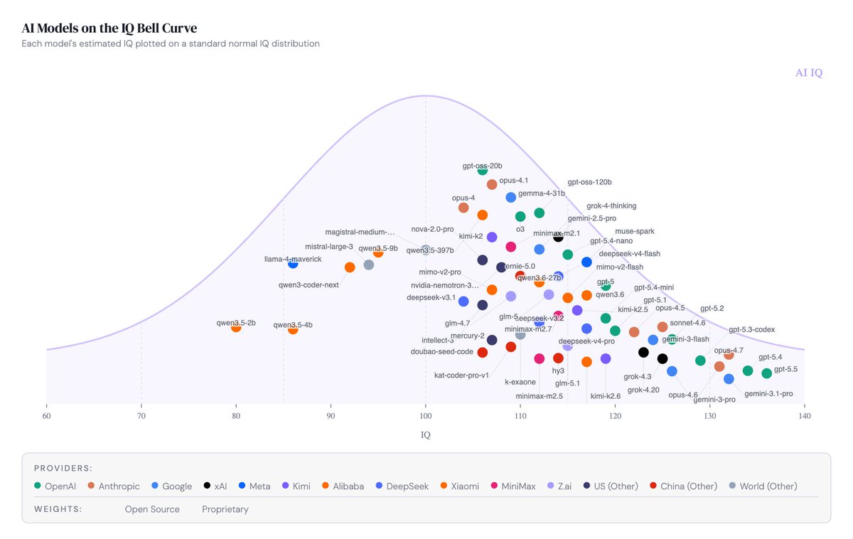
A chart made the rounds last week: frontier AI models placed on a human IQ scale, side by side, like students on a class ranking. I shared it, and it travelled further than most of my posts do.
That reach is worth thinking about, because the chart itself is a bad measurement and it is simultaneously one of the more useful artefacts in AI communication right now. Both things are true, and the tension between them is the actual story.
Why the number is weak
Start with what an IQ score actually is. It is a statistic normed on human populations and built to predict human outcomes like school performance and job performance, which means the number only carries meaning relative to a reference group of people. Apply it to a system with perfect recall, no working-memory limit and strange blind spots in spatial reasoning, and you get a number floating free of the distribution that gave it meaning. You can compute it. You cannot really interpret it.
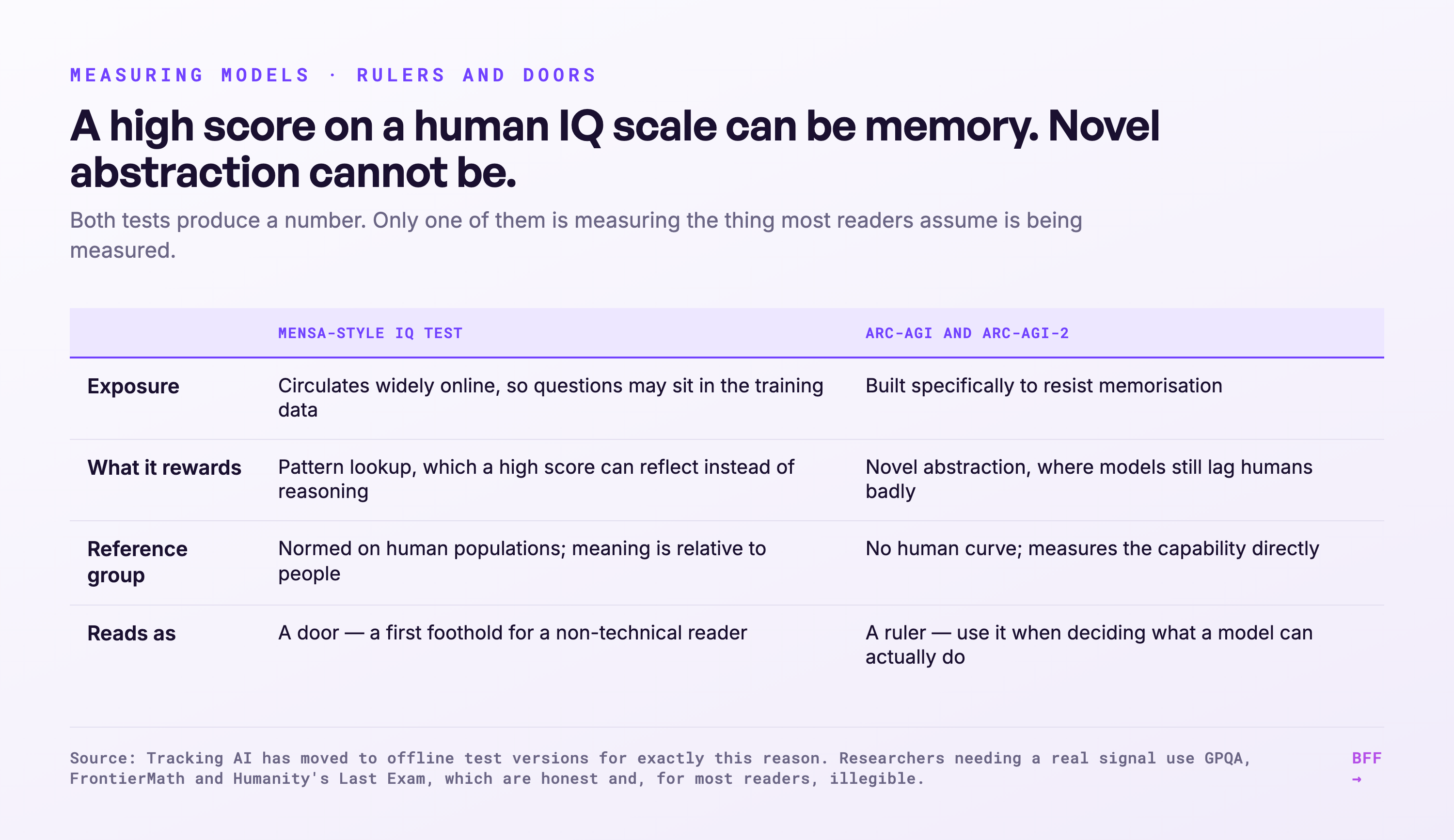
Then there is the contamination problem, which I think is the sharper critique. The public IQ tests people run these models through, and Mensa Norway is the common one, circulate widely online, which means the questions may well sit somewhere in the training data. A high score can reflect memorisation rather than reasoning. Projects that track AI "IQ" over time, like Tracking AI, know this, which is why some have moved to offline test versions the models cannot have seen. Even then the construct mismatch stands, because you are grading a very different kind of mind on a very human curve.
The cleanest demonstration of the gap comes from benchmarks built specifically to resist memorisation. ARC-AGI, and its harder successor ARC-AGI-2, tests novel abstraction with puzzles that do not reward pattern lookup, and models that would post impressive scores on a Mensa-style quiz still lag humans badly there. A system can look brilliant on a human IQ scale and stumble on abstraction tasks a child handles, and that combination is what tells you the IQ number is not measuring what most people assume it measures.
Researchers who need a real signal use instruments designed for the job: GPQA for graduate-level science questions, FrontierMath for research-level mathematics, Humanity's Last Exam for expert-level breadth the models have not already saturated. Those are the honest rulers, and for most people they are also completely illegible.
Wrong in the specifics, right in the gestalt.
Why the chart works anyway
Here is the thing I keep running into in keynotes and boardrooms. Someone always asks a version of "yes, but how smart are they really?" I can answer with GPQA percentages and ARC-AGI pass rates, and I will watch the room glaze over while I do it. Those numbers are accurate and meaningless to a non-technical audience, because nobody has a felt reference point for what 60% on a graduate physics benchmark is like.
Everyone has a reference point for an IQ scale. Average sits at 100, gifted starts somewhere north of 130, and you have been calibrating that scale your whole life through school and colleagues and the people you have worked with. So when a chart places frontier models on it, a non-technical reader gets an immediate sense of where the bar sits, in one frame. Wrong in the specifics, right in the gestalt.
That is why I called it a conversation-opener rather than a benchmark, and why I am expanding on it here instead of walking it back. The chart is a translation device: it converts something illegible, benchmark scores in unfamiliar units, into something legible, a scale you already carry around in your head. Translation always loses precision. The only question worth asking is whether what survives is worth having, and here I think it is, provided you know what you are holding.
The mental model: rulers versus doors
The distinction I would offer is that some measurements are rulers and some are doors. A ruler has to be accurate, because decisions rest on it. A door only has to get someone into the room where the real conversation happens.
GPQA, FrontierMath and ARC-AGI are rulers. Use them when you are deciding what a model can actually do, whether to deploy it, and where it will fail on you.
The IQ chart is a door. Use it when someone outside the field needs a first foothold, and then walk them through to the harder truth on the other side, which is that these systems do not sit anywhere on a human scale at all. They are superhuman in some directions and subhuman in others, at the same time. The jagged profile is the real finding, and no single number can carry it.
The failure mode I worry about most is treating a door like a ruler, which is what happens when someone reads "this model has an IQ of X" and starts making hiring or policy decisions on the back of it. There is a subtler failure mode on the other side, though, which is dismissing the door entirely because it is not a ruler and leaving most of your audience standing outside the room.
Expect more of these charts, with bigger numbers, as the models improve. Each one will be technically indefensible and communicatively effective. Knowing which job you are asking the chart to do is the whole skill.

Ruben Horbach
Co-founder · Back From the Future
Ruben researches how organisations adopt AI meaningfully — not as technology, but as a change in work and people. He builds the agent infrastructure behind BFF and speaks about the near future of work.